Introducing our brand new logo – a symbol of growth, heritage, and innovation
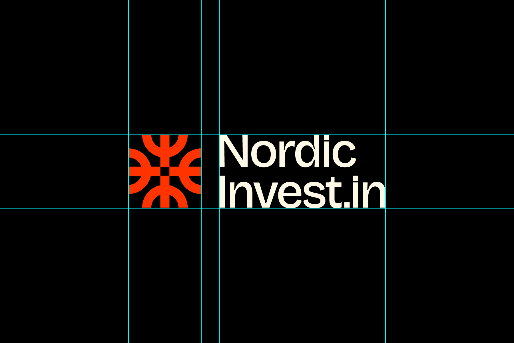
Nordic Investin Group is growing, and as we evolve, so does our identity. As part of this journey, we are proud to introduce our new logo – a modern interpretation of both our heritage and our vision.


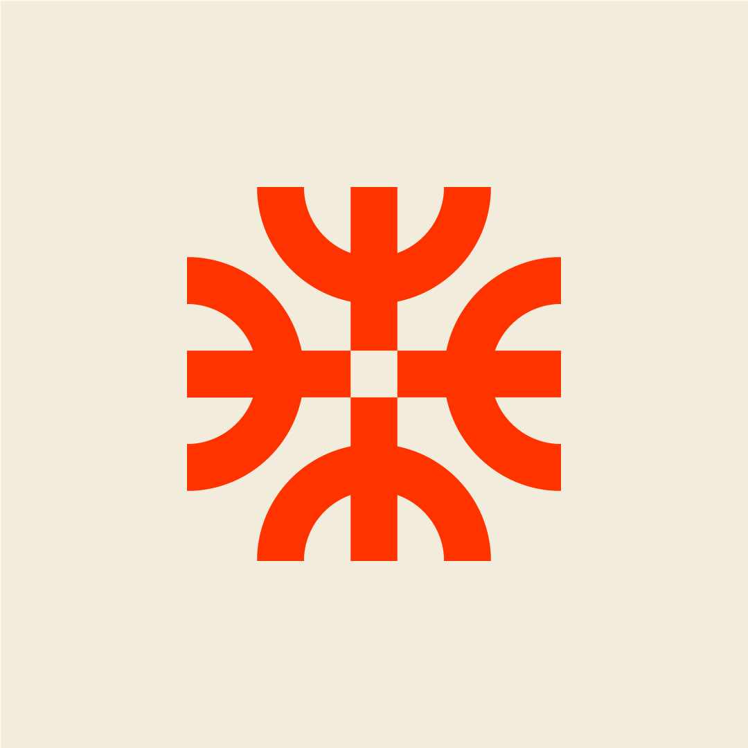
The elk as our starting point
The elk has long been a central part of our identity. In our new logo, we’ve preserved its strength and symbolism, while giving it a more abstract and stylized form.
Bridging tradition and innovation
The design draws inspiration from ancient rock carvings and runes, reimagined with a contemporary, tech-inspired expression. This creates a bridge between Nordic heritage and our mission to drive the ideas of the future.
The rune symbol for elk – representing strength and support – carries forward the essence of our previous logo, while taking on a fresh and modern character.
A subtle metaphor for growth, finance and people
As the symbol repeats, one elk becomes four, reflecting both growth and expansion. The crown-like shapes also hint at finance, capital, and growth – the very foundation of our business. At the same time, the symbol can be seen as people standing side by side with raised arms, reminding us that behind every idea, investment, and innovation, there are people.
From early communication to today
Runes and carvings were among the very first forms of communication and knowledge transfer in the Nordic region – an early “educational system.” By referencing this, we highlight our role in fostering, sharing, and enabling ideas that carry forward into the future.
With our new logo, we honor our origins while looking ahead. It represents strength, support, and community – the very values that define Nordic Investin Group.